Why Your App Feels "Off" (It's The Icons): A Guide to Visual Harmony
The "Uncanny Valley" exists in UI design too. Here is why mixing icon styles makes your users intuitively distrust your application and the 7 rules to fix it.
Icora Team
Design
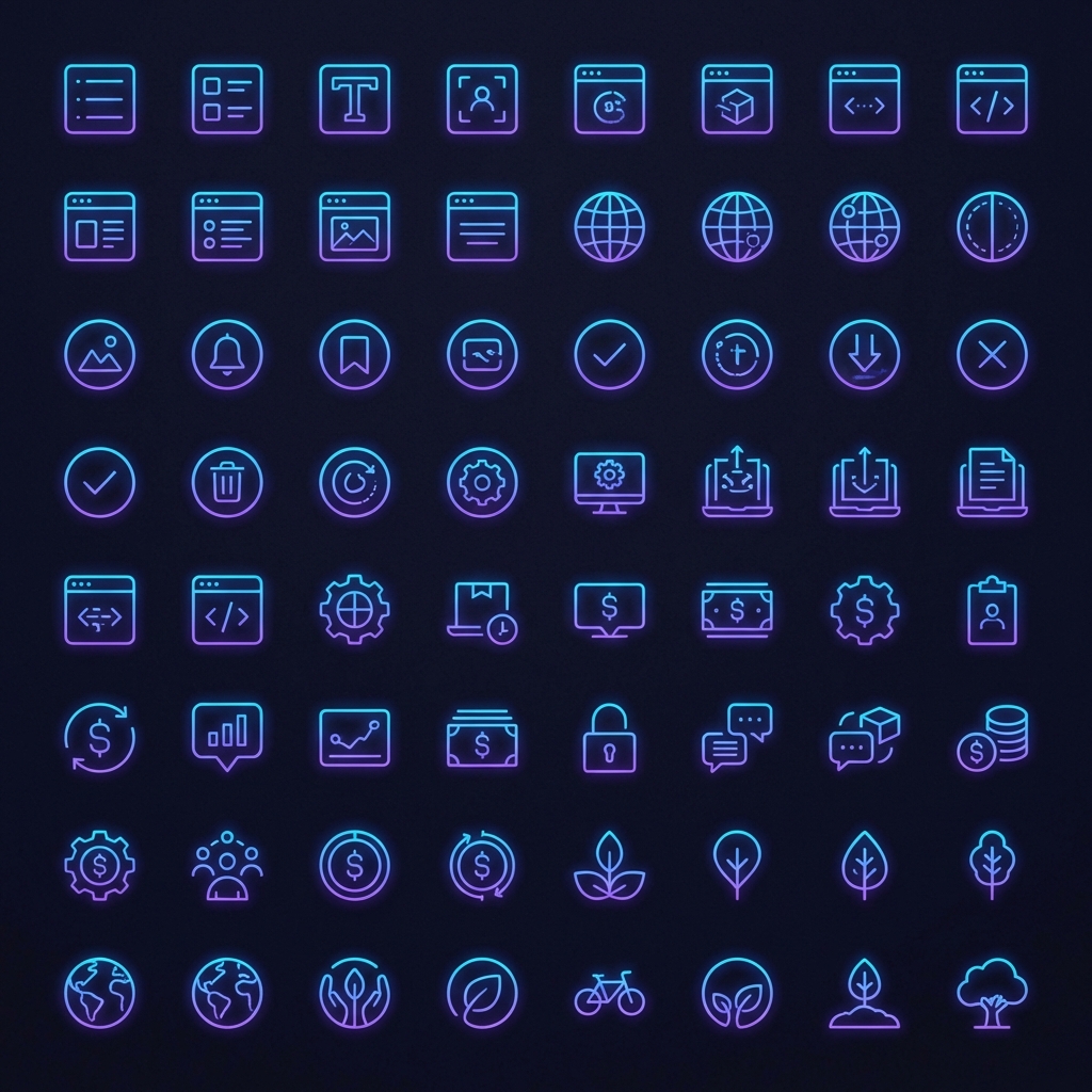
Have you ever walked into a room where one chair is Victorian antique, another is IKEA modern, and a third is a plastic lawn chair? It feels chaotic. It feels temporary. It feels cheap. It makes you wonder if the architect knew what they were doing.
Yet, we do this to our digital rooms all the time. A "Settings" gear from Material Design. A "User" profile from Font Awesome. A custom "Logo" drawn by your nephew. To the designer, they might look "close enough." To the user, they scream "amateur."
The Subconscious Trust
Users are excellent pattern matchers. Even if they aren't designers, their brains notice when the stroke weight changes from 1.5px to 2px. They notice when one icon has rounded corners and another has sharp ones. They may not articulate it, but they *feel* it. This feeling translates to a lack of trust.
The 7 Pillars of Consistency
To fix this, you need rules. Strict ones. Here is the checklist we use for every set we audit:
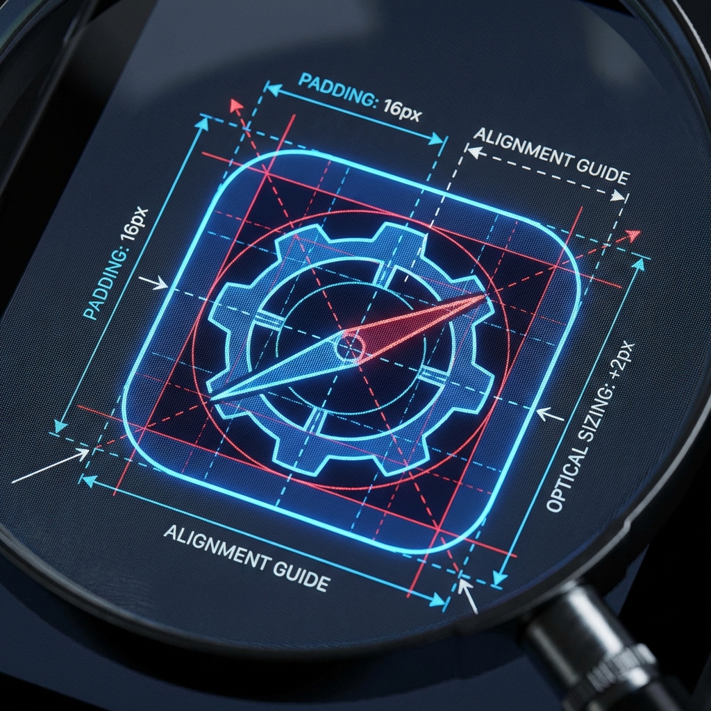
- Stroke Weight: Must be identical (e.g., exactly 2px at 24px size).
- Corner Radius: Consistent rounding (e.g., 2px radius on all external corners).
- Perspective: 2D Flat vs Isometric. Never mix them.
- Terminal Shape: Butt cap vs Round cap stroke endings.
- Level of Detail: Simple outline vs Complex illustration.
- Fill State: All outline or all solid. Mixing indicates state (active/inactive), not style.
- Optical Volume: Do they "feel" the same size?
The Art of Optical Correction
Mathematics is a liar. If you draw a 20px square and a 20px circle side by side, the circle will look smaller. Because it has less surface area (the corners are missing). To make them *look* equal, you must break the grid.
Rules of Thumb:
- Square: 20x20px
- Circle: 22x22px (Overshoot)
- Triangle: 22x20px (Overshoot vertically)
- Rectangle: 24x16px (Wider to compensate for height)
Pro Tip
Trust your eye, not the numbers. If it looks wrong, it is wrong, even if the math says it matches.
AI as the Great Equalizer
This is where AI is revolutionizing the workflow. In the past, if you needed a custom icon that matched your set, you had to hire an illustrator. Now, you can feed an "Anchor Icon" into an AI model and say: "Make me a magnifying glass in exactly this style."
Create Anchor Icons
Generate 3-5 icons that define your style. These become the reference for everything else.
Analyze Characteristics
Document the stroke weight, corner radius, detail level, and perspective of your anchors.
Refine Your Prompt
Write a detailed style prompt incorporating your analysis. Be specific about weight, corners, and style.
Batch Generate
Use the refined prompt to generate remaining icons. Workspace mode maintains consistency.
Manual Refinement
Edit outliers in Studio. Adjust any icons that don't match the set characteristics.
Export Together
Export all icons with identical settings to ensure consistent optimization.
| Style | Stroke Weight | Best For | Example Sets |
|---|---|---|---|
| Light | 1-1.5px | Modern, airy interfaces | Feather, Phosphor Light |
| Regular | 1.5-2px | Most applications | Lucide, Heroicons |
| Medium | 2-2.5px | High contrast needs | Font Awesome, Tabler |
| Bold | 2.5-3px | Emphasis, navigation | Phosphor Bold, custom |
Found this helpful? Share it!
Ready to Create Stunning Icons?
Put these principles into practice with Icora's AI-powered icon generator, professional studio tools, and developer-ready export.
Start Creating Free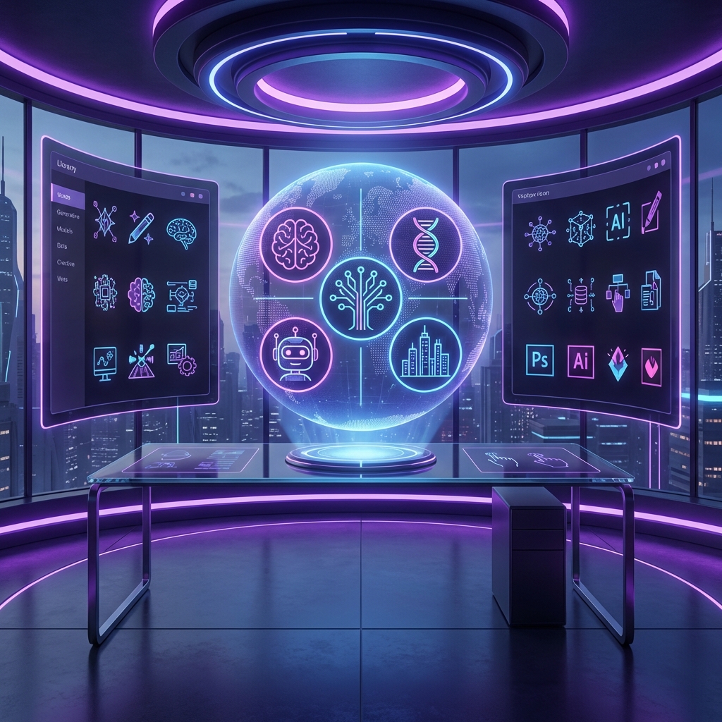